 Your A-Z Swagman has been involved in print production for many… MANY years now. In all those years, there have been many folk who like to take on the task of creating their own artwork. To that, kudos for looking after your brand. I would like to take a brief (yeah, right — this may be one of my longest posts!) moment to illustrate some of the benefits of engaging a graphic arts professional to help shepherd your brand graphics.
Surely most of you have heard of Adobe Photoshop — and many of you have probably also heard of the companion program, Illustrator. If you’re using them, well and good, we can discuss production techniques in a later blog posting. However, your A-Z Swagman has received art files generated from several other, online or free to download, applications. I’d like to go over some techniques when using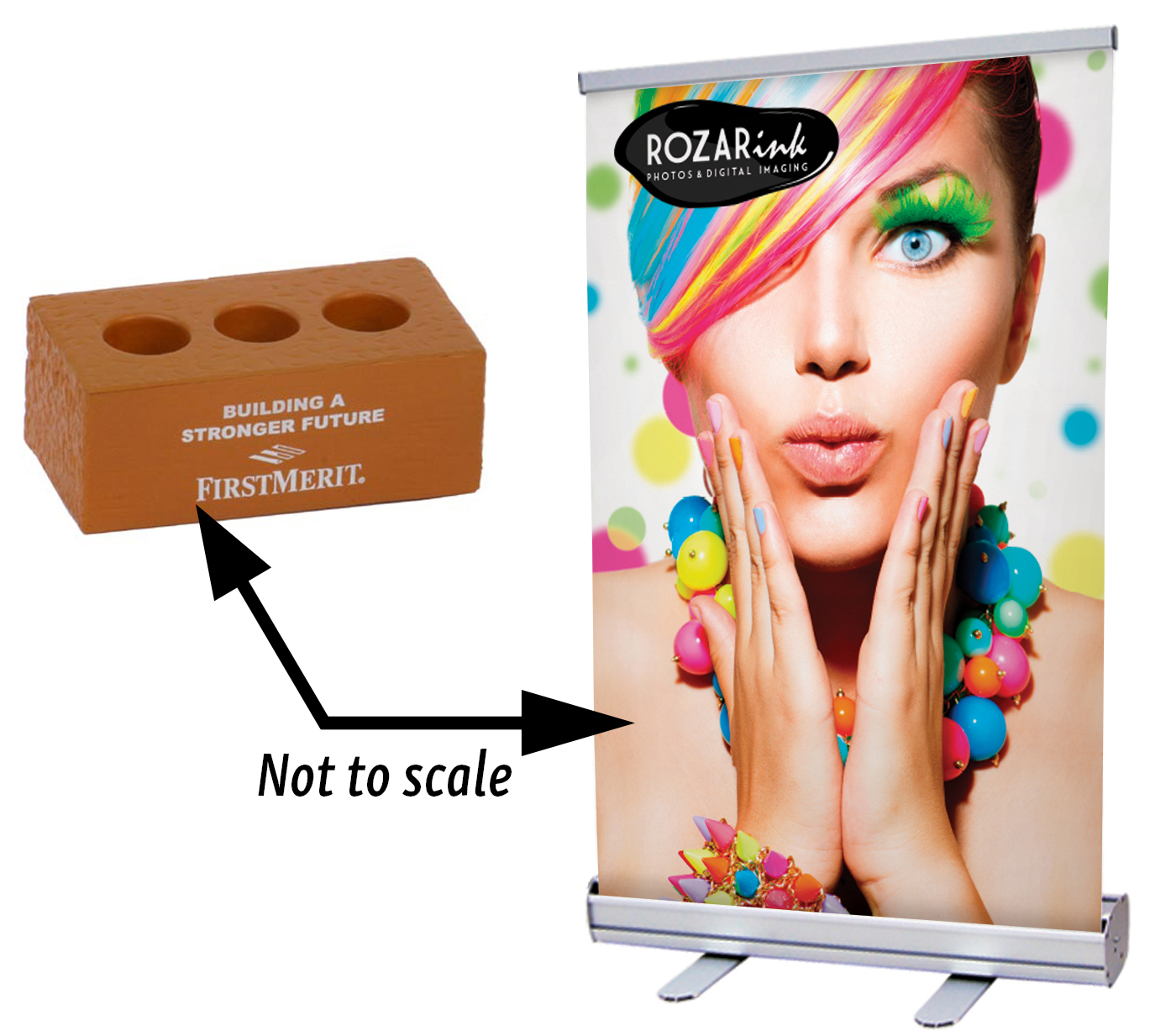 Canva, a free online graphics program. This may help those of you self-starters, as well as illustrate the benefits of those in your A-Z Swagman’s profession.
Job Colors
The first thing we need to know is if the goal is to print a single color, as in the brick shaped stress toy, or full color, as in the retractable banner here. Full color usually involves photos which need to be the highest resolution possible — downloading a pic from your corporate website is not sufficient for a large banner, you’ll wind up with jaggies. Vector artwork is the chosen form for logos and single-color artwork.
A quick side note on your A-Z Swagman’s methodology: The free version of Canva does not have, or I was unable to find, obvious inspection tools. Therefore, I downloaded projects and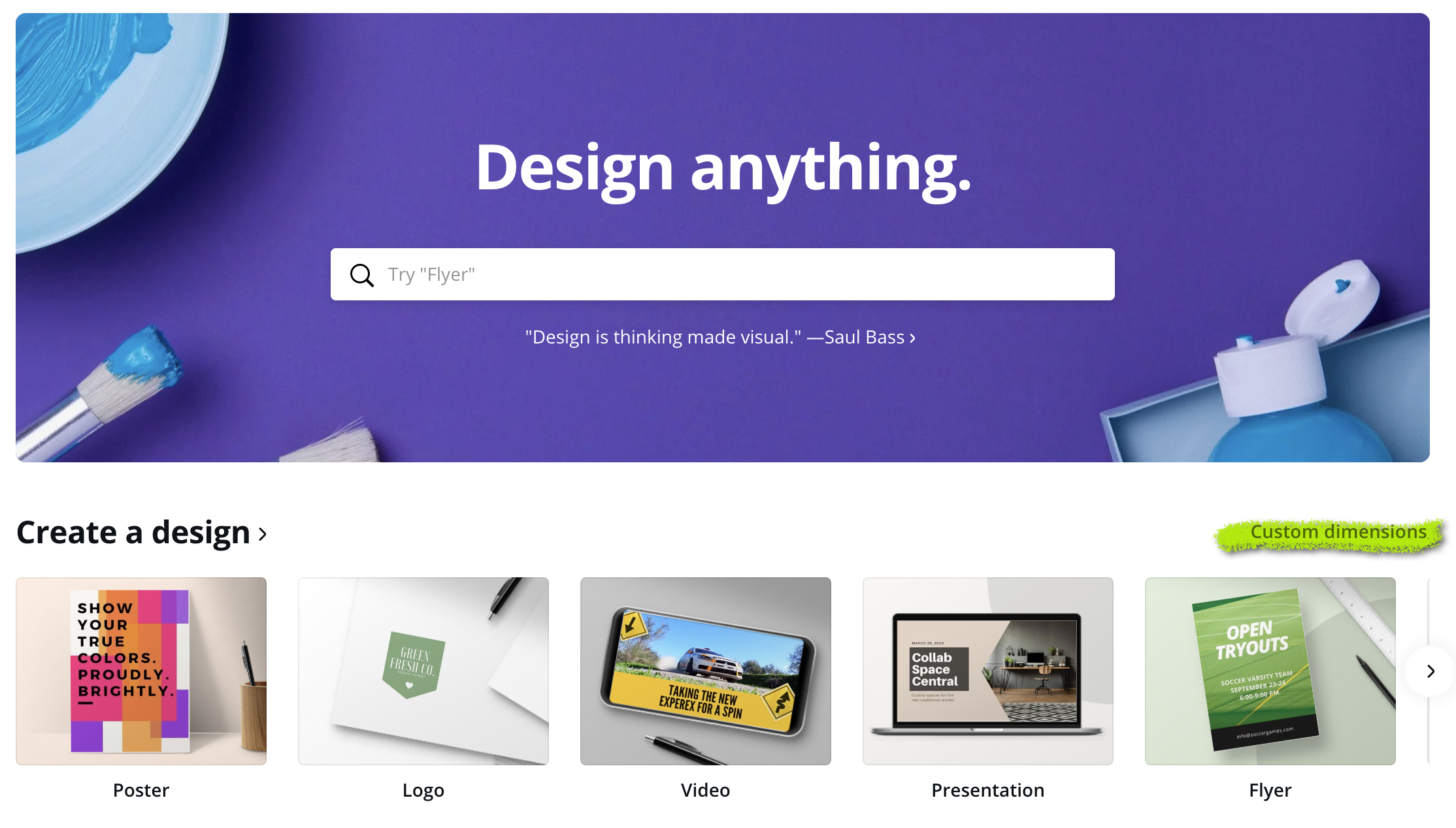 opened them in Adobe Illustrator to inspect different elements using the tools with which I’m familiar. It’s possible that these tools are available in Canva Pro — I’d be very interested in hearing from anyone who uses Pro, please email me at swagman@azorinc.com.
File Setup
First, it’s tempting to go with a template, but if you know the imprint area of your promotional product, or the page size of your printed project, I suggest using the 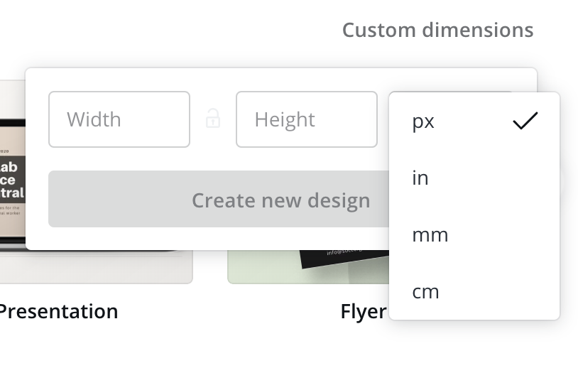 Custom Dimensions option (be sure to change the units to inches!) The brick shaped stress toy for example, has an imprint area of 2.5 x 1-inch, so a 12 x 18 (poster size) might be a bit large! Custom dimensions will also help when you’re incorporating bleeds (more later).
Tools
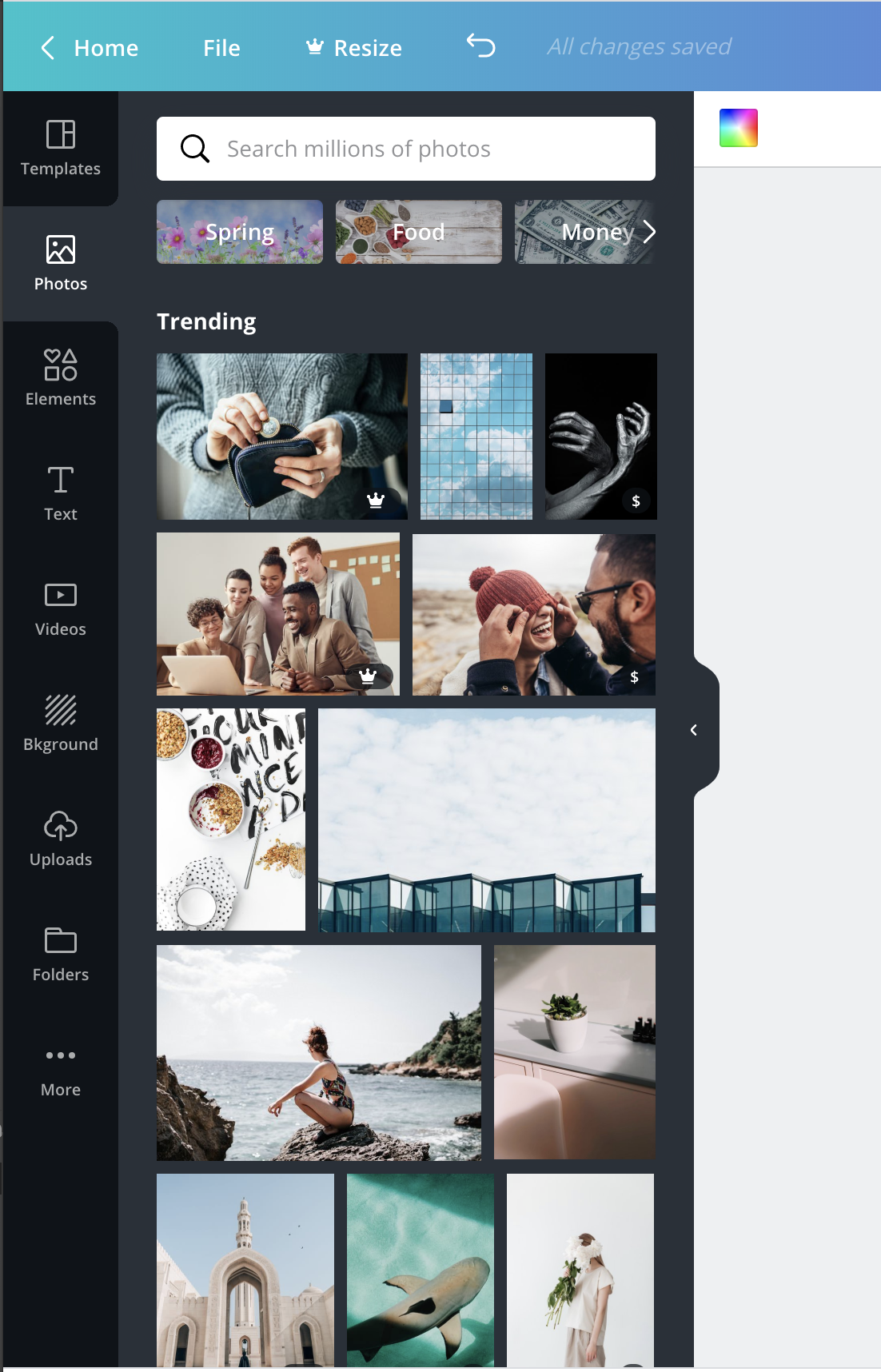 Now looking over the tools available in Canva, we can see several tools on the left hand panel, including templates, photos, elements, text, video, background, etc. Photos and backgrounds are obviously resolution-dependent images. A few notes on that later down.
Elements and text both have vector art. Text suffers from one problem, you cannot embed the font, nor can you convert text to outlines. That’s just one of those things to discuss with your printer or promo products distributor when you place an order. At the very least, give them a list of the exotic fonts you used in your design so they’ll have a plan when they see Missing Font messages.
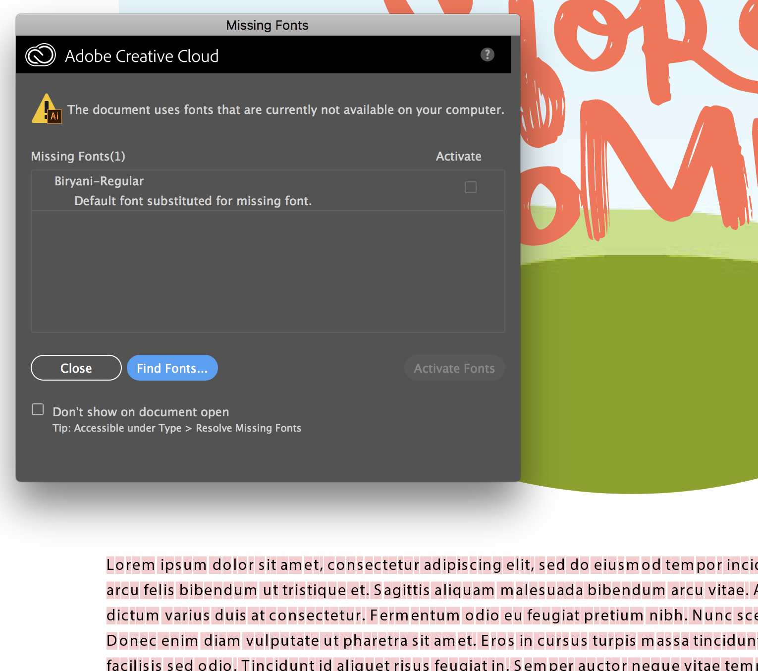
I did find, to my surprise, that some of the elements are NOT vector.
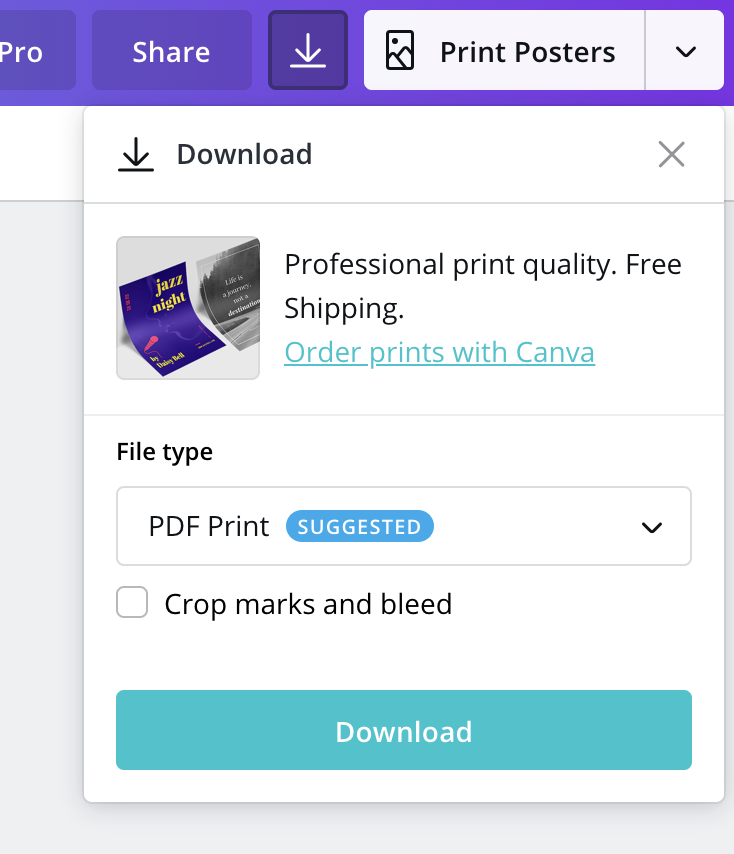 A note on proper downloading from Canva: JPEG and PNG are both pixel-based formats and thus are no good for single-color files. Video and Animation are obviously no good
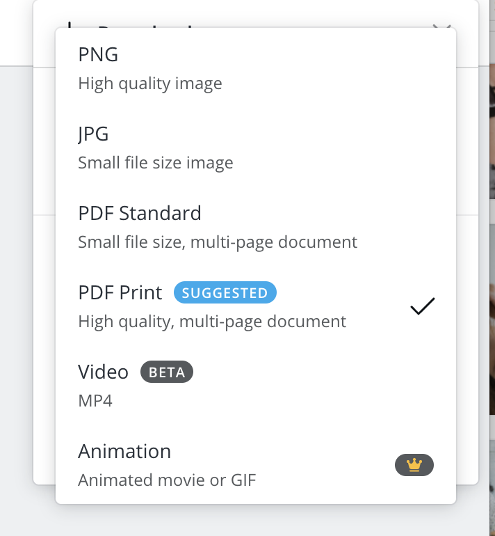 for static images. PDF is the proper choice, and you should always go for the high-quality option.
When I downloaded the first test page, I discovered that only one of the two elements I’d chosen was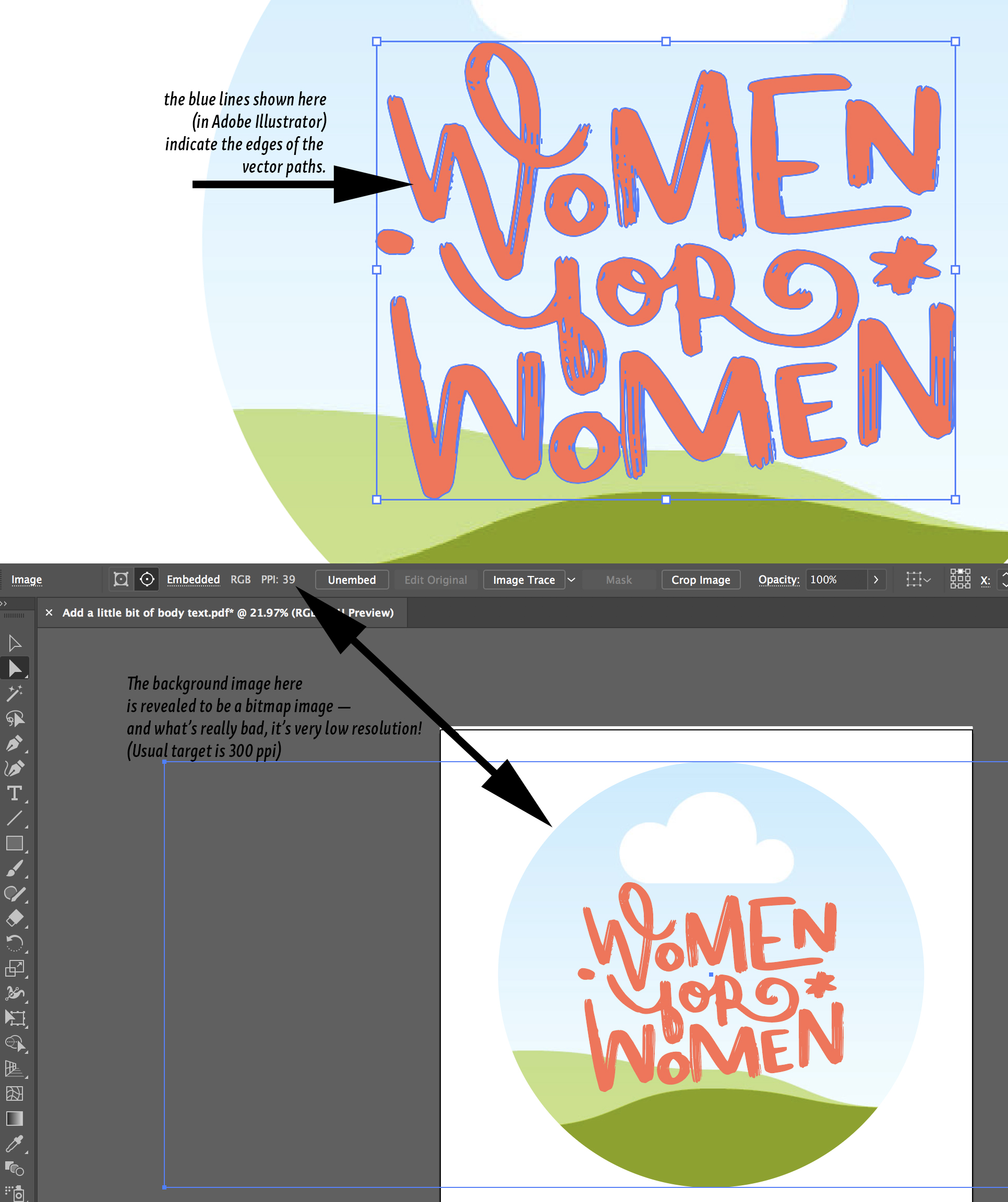 vector art. The other turned out to be a bitmap image as you can see in the screen captures
from Illustrator here. In fact, the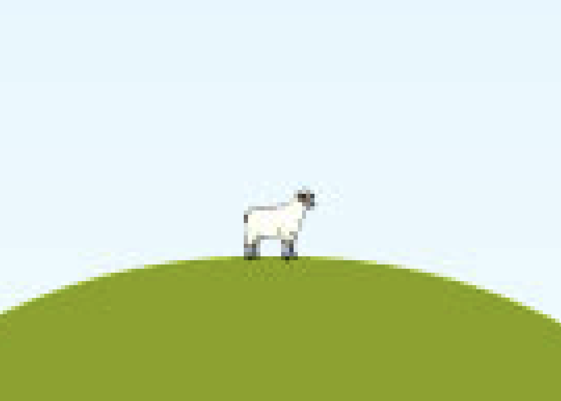 hilly background is so low resolution that the poor little sheep on the hill is just a few square black and white pixels.
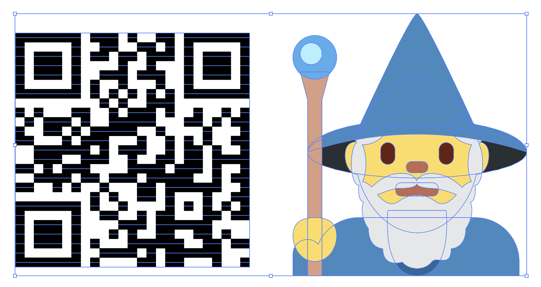 I’m happy to report that both the QR code generator and the Emojis (accessible through More) did create vector art. As you can see in this image, the QR code for www.azorinc.com, and the old blue wizard have the blue bounding box shapes indicating that they are made up of vector paths, rather than pixels.
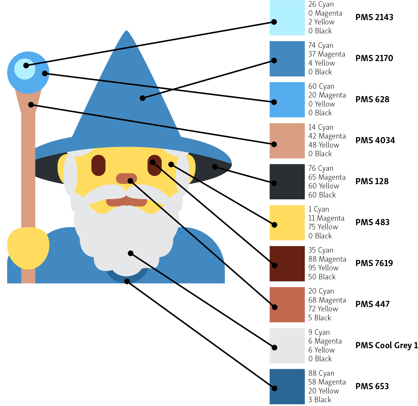
This does bring us back to one of the first things discussed in this blog entry — the number of colors for your print job. The QR code is a single color and can be reproduced in black, red, magenta, green or even turquoise. But if you want to print the wizard on the brick, we’ll need to reduce the number of colors from ten — yes there are ten potential spot colors in the wizard. Don’t believe me? Take a look at this breakdown, even his beard is a spot color. The good news is that his shirt is the same color as his hat and his hand is the same color as his face. Please note this is an absurd number of spot colors and you will probably never find a decorator who would take this on. The overall expense, not to mention the extra 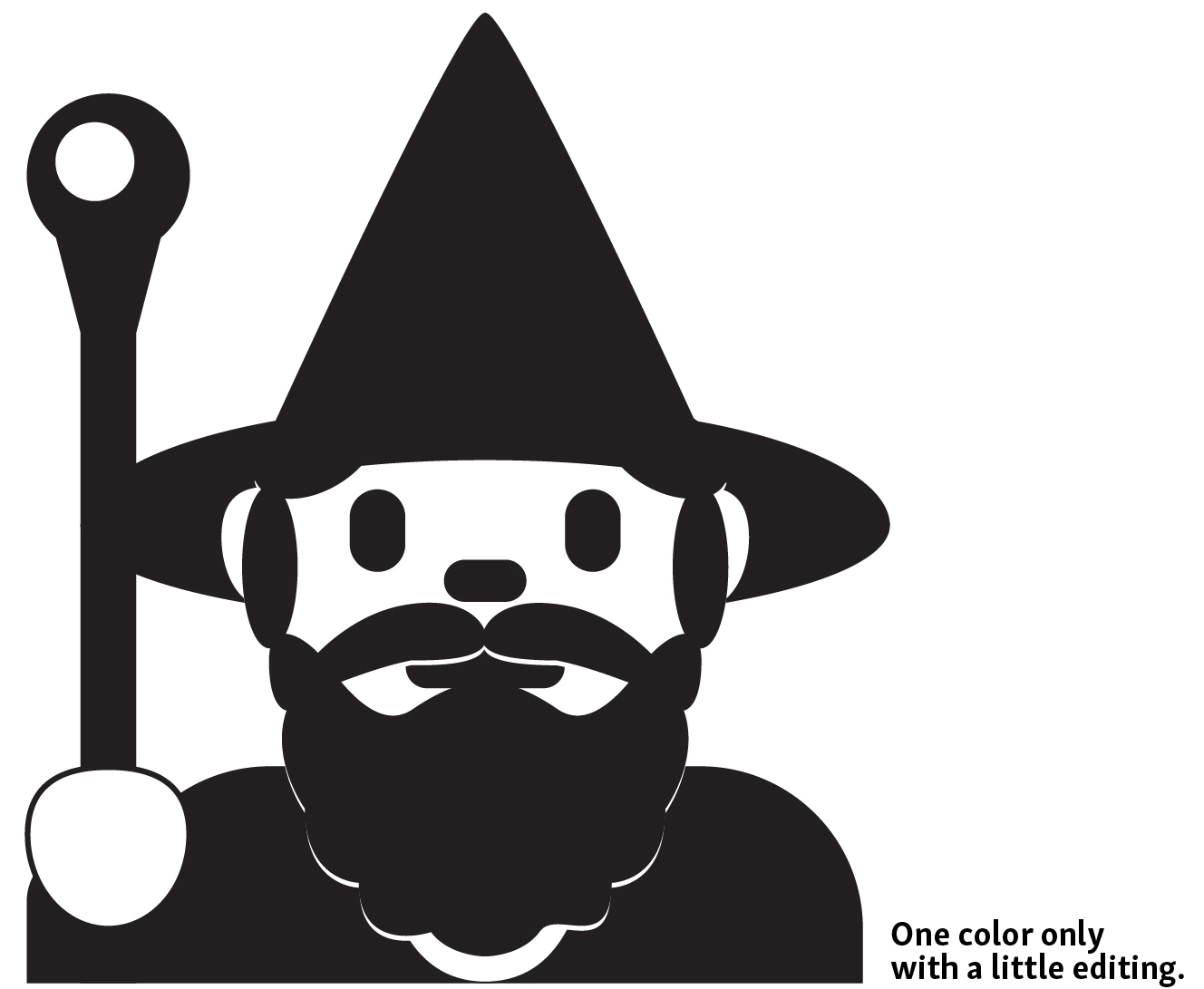 charges for mixing specific PMS colors would be astronomical. Add to that the registration difficulties and this is a non-starter.
With a little creative editing in Illustrator (I was unable to find any tools to do this in Canva), your A-Z Swagman was able to reduce the wizard to a single color design, which can be reproduced on the brick or other promo products in your choice of colors.
Of course, if the product we’re producing will be printed using full color (CMYK), like the banner, then there’s nothing wrong with the original wizard.
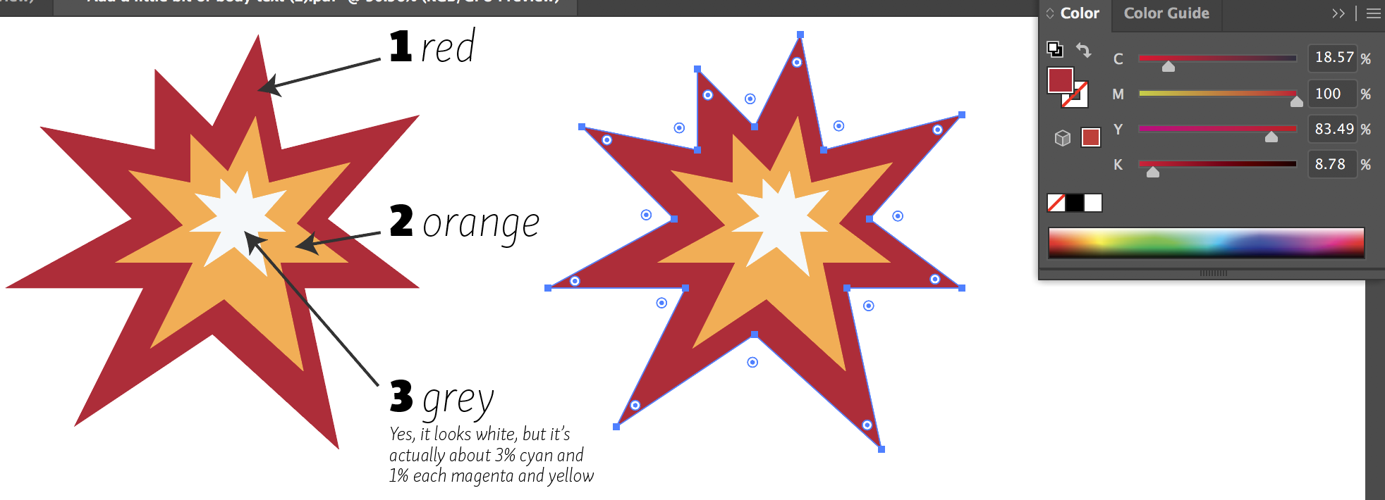 One thing I did find in Canva were controls on spot-ish colors. As you can see in this Illustrator screen shot, the starburst is vector art, made up of three (technically non-spot) colors. For our purposes we’ll assume that specific PMS (Pantone Matching System) colors will be assigned at some point after the creation of the Canva document. So as long as you know the color numbers you need, and can represent them approximately, your file will be fine.
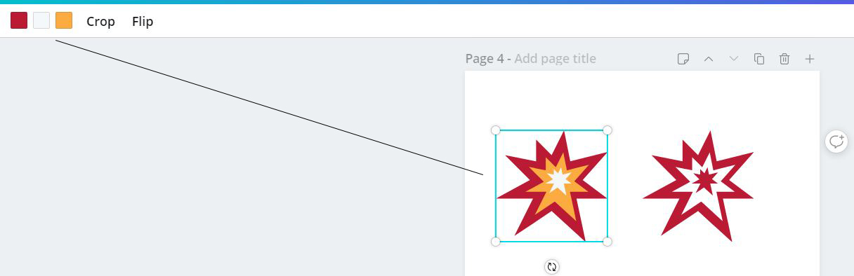
In the next two images, I’m showing where the color controls are in Canva. I did have to hunt a little as the location is not exactly intuitive. In this first image, I have the original starburst emoji selected, bringing up the three color chips in the upper left corner. Please don’t ask me why they’re out of order.
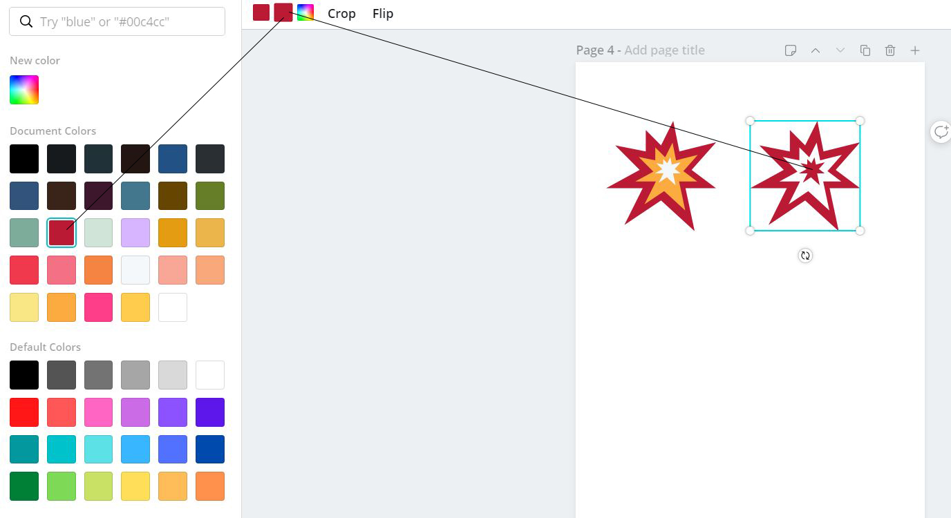
In this next image, I’ve selected the starburst emoji that I’ve changed to print in a one-color application. You can see that clicking on the chips brings up a pallet of colors from which to choose. The rainbow chip is apparently left active even if the New color you choose is within the list of colors. You can see that I’ve changed the inner burst to the same red as the outer, and the middle burst is now white.
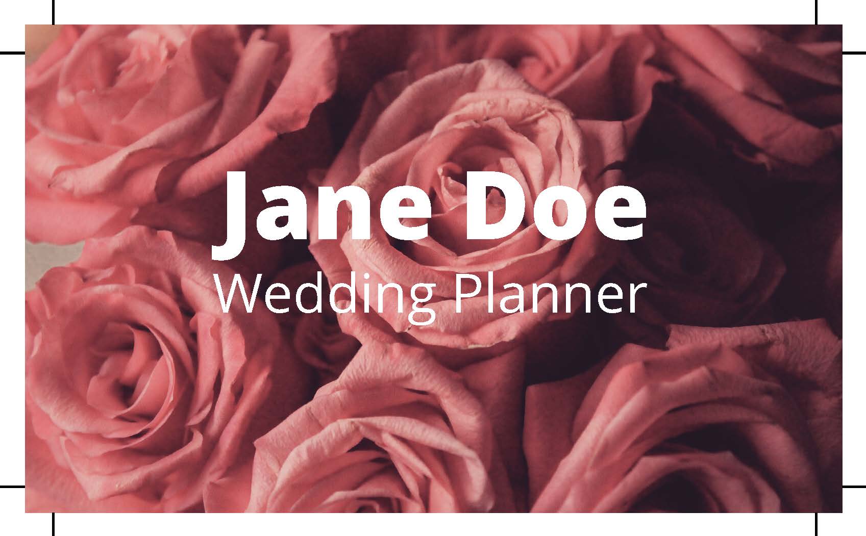 An image is said to bleed when any part of the printed page runs all the way to the edge. Business cards are an easy visual, and I have to say the free version of Canva did a decent job with a quick little example. First, on download, ignore the suggested PNG format (that’ll give you a bitmap file). Choose the PDF Print option, and be sure to check the Crop marks and bleed box. The resulting file would be adequate to print in most circumstances. The only two issues I found were the fonts were missing and the background image was left in RGB mode (only an issue for more critical color matching). Most critically, this test automatically included the extra 0.125-inch image required for bleed images.
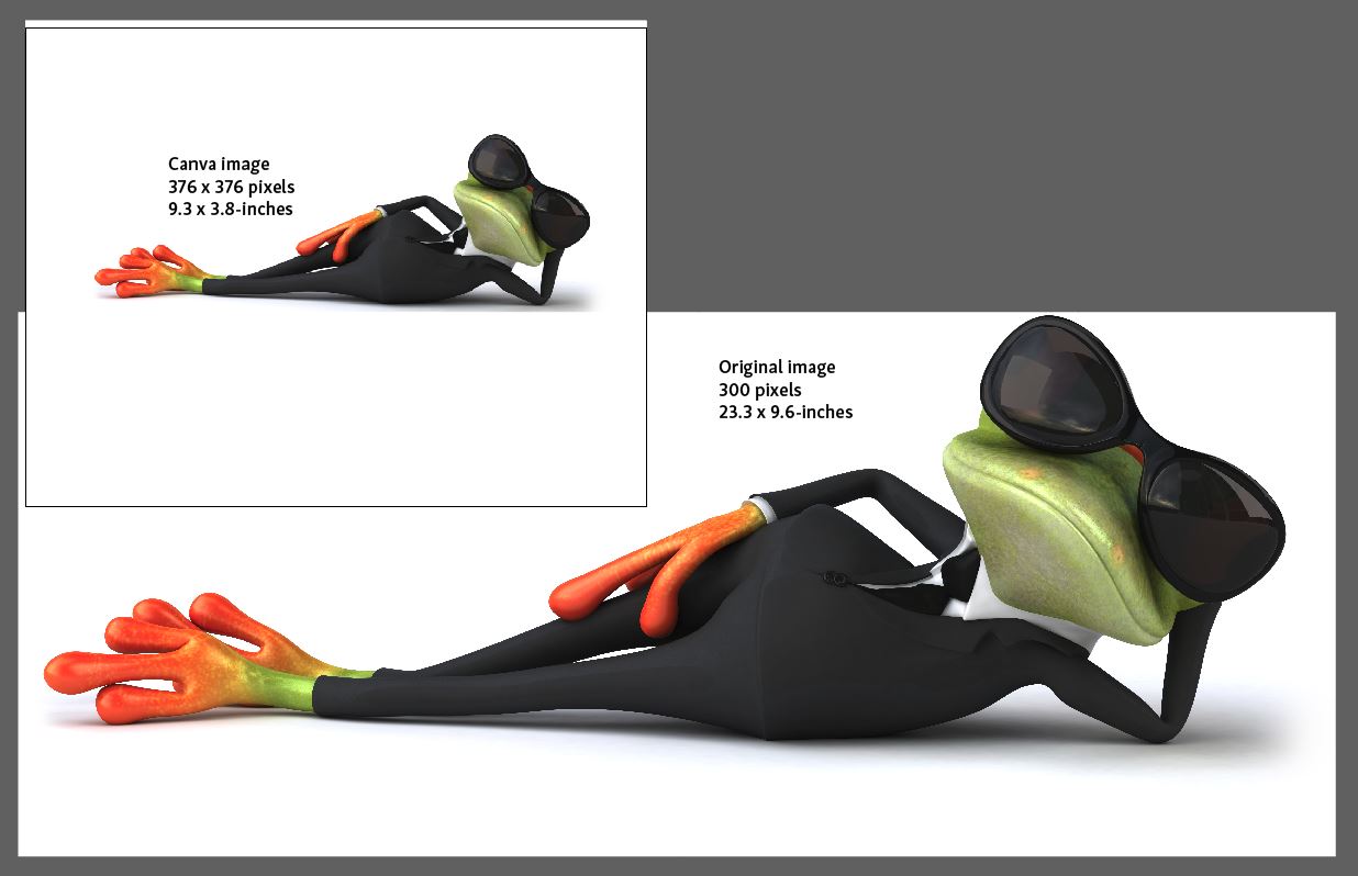
Images can also be added manually through Uploads. When you upload an image, and then use it in a Canva document, it apparently down-samples it to fit the layout dimensions. As you can see here, our reclining frog was reduced to fit on a letter size page, while the original is much larger at full resolution. Be ready to supply your original photos — in the highest possible resolution — to your decorator! Note that any images you’ve downloaded from a web page (save as) will be lower resolution and will not be good for print jobs.
Summary
Let me try to bullet point the points of this blog entry:
· If you’re using free Canva to create finished art for projects:
o Use Custom Dimensions when starting each design project.
o Avoid using Photos or Backgrounds when your art is going to be reproduced in a single color.
o When using Elements, pay attention to the multi-color ones. You may have to ask for help from your printer or promotional product distributor.
o Alert your printer to any fonts you’ve used.
o Know and communicate the PMS values you need for your brand. If you’re starting from scratch, this is a good time to establish your standards.
o Full-color graphic elements (Photos, Backgrounds and some Elements) may be lower resolution than required by your decorator. Be ready to share the full-resolution images.
· If you’d like to know why you should engage a professional:
o Free Canva does not include PMS values.
§ Establishing creative standards allow your brand to be consistent moving forward. Graphic design is one important part of those standards.
§ Pantone Matching System is a consistent color across most applications. Establishing a web-based color (like #bb1a34) does not give you a reproducible print color. Establishing a CMYK color (like 18.57 Cyan, 100 Magenta, 83.49 Yellow, 8.78 Black) will not reproduce the same across all printers or presses.
o Professionals will know when they need to convert fonts to paths.
§ The AZOR logo is made up of fonts and a square black background shape. Because the file consists of fonts converted to paths, we can use this without concern of seeing our logo in some very unfortunate font choices!
o You may actually be too involved with your company to make the best design choices.
§ As a young designer, your A-Z Swagman once worked for a company going through a design change. When I asked why we’d engaged an outside company to facilitate the change, I was told we were all too close. Our decisions would not follow the best practices of research and designing to reflect the company’s brand voice.
o Of course, you get what you pay for. In this world of the gig-economy, someone offering to design your logo for $25 is worth every penny. That is to say, somewhere down the line, a company might engage a promotional product distributor (such as your A-Z Swagman) and have a MUCH more difficult time than if they’d chosen a higher-priced, but more thorough, marketing professional.
As promised, this has been one of the longer blog entries from your A-Z Swagman. If you read it all, what’s wrong with you? Do you need help getting to sleep? J If not, I’m always interested in your feedback, especially if you have experience with Canva or Canva Pro. Contact me at swagman@azorinc.com to share your thoughts.
Title image from morguefile.com